Accessibility Audit: Sign In And Register
| Page URL | https://apps.dcyf.wa.gov/MERIT/Home/SignInRegister/Index/loginLink |
| Page Name | Sign In And Register |
| Date | 2026-03-28 |
| Auditor | Claude Code (automated) |
| Standards Reference | docs/standards/ (WCAG 2.2 AA) |
Evidence
| Screenshot (1920x1080) | Screenshot (320px reflow) |
|---|---|
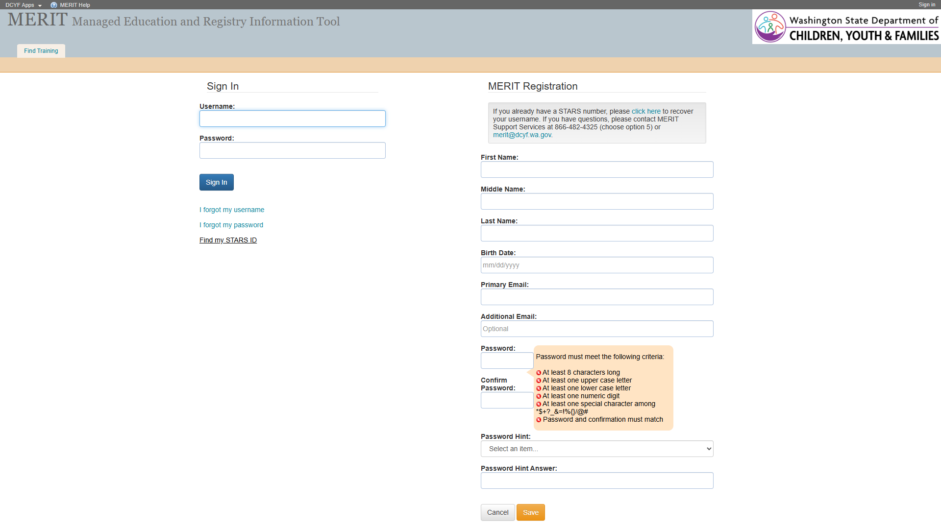 |  |
Section 1: Structure and Semantics
Standards reference: structure-and-semantics.md
| Evaluated | Pass | Fail | N/A |
|---|---|---|---|
| 33 | 22 | 3 | 8 |
Findings
| # | Topic | Requirement | WCAG | Level | Severity | Description | Proposed Fix |
|---|---|---|---|---|---|---|---|
| 1 | Missing Skip Link | A mechanism must exist to bypass blocks of content | 2.4.1 | Required | High | No skip link present. Although a <main> landmark exists (which partially satisfies 2.4.1 for screen reader users), keyboard-only sighted users still have no bypass mechanism for the banner. | Add a visually-hidden, focus-visible skip link as the first focusable element: <a href="#main-content">Skip to main content</a>. |
| 2 | Missing Navigation Landmark | Navigation lists should be designated with <nav> | – | Best practice | Medium | Footer contains a link list (About DCYF, Privacy Policy, MERIT Help) not wrapped in <nav>. The header link list (DCYF Apps, MERIT Help) is also not in a <nav>. No <nav> element exists anywhere on the page. | Wrap navigation link lists in <nav> with distinct aria-label values (e.g., “Header navigation”, “Footer navigation”). |
| 3 | H1 in Banner, Not Main Content | Main content should start with <h1> | – | Best practice | Medium | The only <h1> (“MERIT Managed Education and Registry Information Tool”) is in the banner. The main content area has no heading – it jumps directly to the two fieldsets. Screen reader users expect <h1> at the start of main content. | Add an <h1> such as “Sign In or Register” inside the <main> element before the two form groups. |
Section 2: Links and Navigation
Standards reference: links-and-navigation.md
| Evaluated | Pass | Fail | N/A |
|---|---|---|---|
| 35 | 17 | 9 | 9 |
Findings
| # | Topic | Requirement | WCAG | Level | Severity | Description | Proposed Fix |
|---|---|---|---|---|---|---|---|
| 1 | Skip Navigation | A “skip” link should be the first focusable element | 2.4.1 | Required | High | No skip link present. The <main> landmark helps screen reader users, but keyboard-only sighted users still cannot bypass the banner. | Add skip link as first focusable element targeting main content. |
| 2 | Distinguishable Link Purpose – “click here” | Purpose of each link must be understandable from link text alone or surrounding context | 2.4.4 | Required | High | Registration section contains <a>click here</a> linking to /MERIT/Home/RecoverUsername. “click here” is completely non-descriptive and a well-known accessibility anti-pattern. Screen reader users navigating by links hear “click here” with no context. | Replace with descriptive link text: “recover your username” – e.g., “If you already have a STARS number, please recover your username.” |
| 3 | Distinguishable Link Purpose – “MERIT Help” | Purpose of each link must be understandable | 2.4.4 | Required | High | “MERIT Help” link in both header [e10] and footer [e95] has href="#" – navigates nowhere. Purpose is indiscernible; the link is non-functional. | Provide a valid URL to a help resource, or convert to <button> if it triggers scripted behavior. |
| 4 | Consistent Help | Help mechanisms on multiple pages must occur in same relative order | 3.2.6 | Required | Medium | “MERIT Help” (href="#") is a non-functional help mechanism appearing in both header and footer. This broken help mechanism persists site-wide across pages. | Make “MERIT Help” link functional by pointing to a valid help resource. |
| 5 | Links vs. Buttons | Links should navigate; should not be used for scripted functionality | – | Best practice | Medium | “MERIT Help” link with href="#" does not navigate. “DCYF Apps” link with href="#" also navigates nowhere. Both appear to be non-functional or scripted. | Convert to <button> if they trigger scripted behavior, or assign valid URLs. |
| 6 | Malformed mailto Link | Link markup must use valid href | 4.1.2 | Required | Medium | The email link in the registration section uses mailto://merit@dcyf.wa.gov [e47]. The correct protocol is mailto: (no slashes). This may cause the link to fail in some mail clients or browsers. | Change href to mailto:merit@dcyf.wa.gov (remove the //). |
| 7 | Navigation List Markup | Navigation list should use <nav> element | – | Best practice | Medium | Header and footer link lists are not wrapped in <nav> or role="navigation". | Wrap in <nav> elements with distinct aria-label values. |
| 8 | Multiple Ways | Multiple ways must be available to find other web pages | 2.4.5 | Required | Medium | Limited navigation options: header links, form links, and footer links. No site search, site map, or breadcrumbs. May be acceptable for a pre-auth page. | Verify post-login pages provide at least two navigation methods. |
Section 3: Images and Visual Design
Standards reference: images-and-visual-design.md
| Evaluated | Pass | Fail | N/A |
|---|---|---|---|
| 43 | 28 | 6 | 9 |
Findings
| # | Topic | Requirement | WCAG | Level | Severity | Description | Proposed Fix |
|---|---|---|---|---|---|---|---|
| 1 | Password Requirement Icons Missing Alt Text | Images must have alternative text | 1.1.1 | Required | Critical | Six <img> elements [e68-e73] display checkmark/X icons next to password requirement criteria (e.g., “At least 8 characters long”). All six have no alt text whatsoever. These are informative images that convey pass/fail status of each password criterion. Screen reader users cannot determine whether each requirement is met or not. | Add dynamic alt text to each image that reflects its current state, e.g., alt="Met" or alt="Not met". Alternatively, use aria-label on a containing element. Consider using role="img" with aria-label or replacing with CSS/SVG with aria-hidden="true" and adding visually-hidden text like “(met)” or “(not met)” after each criterion. |
| 2 | Use of Color Alone for Password Status | Color alone must not convey information; must have a visible alternative | 1.4.1 | Required | High | Password requirement icons appear to use color (green checkmark vs. red X) as the primary indicator of met/unmet status. Even though the icon shape differs (check vs. X), the missing alt text means the information is not programmatically available. If the icons use color alone (e.g., green text vs. red text without shape difference), that is also a 1.4.1 violation. | Ensure each criterion has a text-based status indicator (e.g., “(met)” or “(not met)”) in addition to the visual icon. Provide alt text on images. |
| 3 | Image Link Alt Text – Access Washington | Image links should describe the destination | 1.1.1 | Required | Medium | Access Washington logo [e101] in the footer is a link to access.wa.gov. Alt text “Access Washington” describes the image rather than the link destination. | Change to alt="Visit Access Washington" or add aria-label="Visit Access Washington" on the link element. |
| 4 | Small Footer Text | Fonts should be easily readable | – | Best practice | Low | Footer text at 11px (8.25pt) is very small. Version text “V16.26” and copyright text are difficult for low-vision users despite passing contrast. | Increase footer text to at least 14px. Use relative units (rem/em). |
| 5 | Empty List Items in Footer | List markup must use appropriate semantic elements | 1.3.1 | Required | Low | Footer list [e87] contains two empty <li> elements [e90, e93] that appear to be used as visual separators. These are announced by screen readers as empty list items, creating confusion. | Replace empty <li> elements with CSS-based visual separators (e.g., border-right or ::after pseudo-elements on adjacent items), or use aria-hidden="true" on decorative separators. |
Contrast Measurements
| Element | Foreground | Background | Ratio | Required | Result |
|---|---|---|---|---|---|
| H1 “MERIT…” (banner heading) | #853696 | Variable (hero image) | ~3.4-7.1:1 | 3:1 | UNCERTAIN |
| Fieldset legend “Sign In” | Inherited text | #FFFFFF | Needs manual check | 4.5:1 | NEEDS CHECK |
| Link “click here” | Link color | #FFFFFF | Needs manual check | 4.5:1 | NEEDS CHECK |
| Button “Sign In” / “Save” / “Cancel” | Button text | Button background | Needs manual check | 4.5:1 | NEEDS CHECK |
| Footer text (11px) | #212529 | #FFFFFF | ~15.43:1 | 4.5:1 | PASS |
| Footer links | #0D6EFD | #FFFFFF | ~4.50:1 | 4.5:1 | PASS (borderline) |
Section 4: User Input, Forms, and Dynamic Content
Standards reference: user-input-forms.md
| Evaluated | Pass | Fail | N/A |
|---|---|---|---|
| 117 | 30 | 14 | 73 |
Findings
| # | Topic | Requirement | WCAG | Level | Severity | Description | Proposed Fix |
|---|---|---|---|---|---|---|---|
| 1 | Labels Not Programmatically Associated – Sign In Form | Labels must be programmatically associated with their corresponding elements | 1.3.1 | Required | Critical | The Username and Password fields in the Sign In form have adjacent text nodes (“Username:” and “Password:”) but these are plain text, not <label> elements with for attributes or wrapping <label> elements. The textbox elements [e31, e33] have no accessible name. Screen reader users hear “edit text” with no label when they focus these fields. | Wrap each label/input pair in a <label> element, or use <label for="inputId"> with matching id on each <input>. Alternatively, add aria-label or aria-labelledby to each input. |
| 2 | Labels Not Programmatically Associated – Registration Form | Labels must be programmatically associated with their corresponding elements | 1.3.1 | Required | Critical | All registration form inputs (First Name [e50], Middle Name [e52], Last Name [e54], Birth Date [e56], Primary Email [e58], Additional Email [e60], Password [e64], Confirm Password [e66], Password Hint Answer [e77]) have adjacent text labels but none are programmatically associated. The combobox [e75] for Password Hint also has no programmatic label. Screen reader users cannot identify any of these 10 fields. | Add <label for="..."> elements for every input and the combobox. Each <input> needs a unique id that matches the for attribute of its <label>. |
| 3 | Password Fields Not Masked | Password input must use type="password" for security and semantics | 3.3.2 | Required | High | Both the Sign In password [e33] and Registration password [e64] and Confirm Password [e66] fields appear in the accessibility tree as textbox role rather than a password input. This suggests they may not use type="password", which means: (1) passwords are visible on screen, (2) browsers cannot offer password autofill, (3) assistive technologies cannot announce the field as a password field. | Change all password <input> elements to type="password". The Sign In password, Registration password, and Confirm Password fields should all use <input type="password">. |
| 4 | Required Fields Not Programmatically Designated | Required fields should be programmatically designated as such | – | Best practice | High | Multiple fields are required (evidenced by validation messages like “Username is required to sign in” and “Please enter First Name to complete your registration”), but no required attribute or aria-required="true" is present on any input. Screen reader users cannot distinguish required from optional fields before submission. | Add required or aria-required="true" to all required fields: Username, Password (Sign In), First Name, Last Name, Birth Date, Primary Email, Password, Confirm Password, Password Hint, Password Hint Answer (Registration). |
| 5 | Validation Messages Not Programmatically Associated | Instructions/errors must be programmatically associated with their element | 3.3.2 | Required | High | Validation messages (e.g., “Username is required to sign in.” on container [e30], “Please enter First Name to complete your registration.” on container [e49]) are accessible descriptions on wrapper <div> elements, not on the inputs themselves. These messages are not linked to the actual <input> elements via aria-describedby or aria-errormessage. Screen reader users will not hear these messages when focused on the input fields. | Add aria-describedby or aria-errormessage on each <input> referencing the id of its validation message element. Use aria-invalid="true" on fields with errors. |
| 6 | Missing Input Purpose Identification (autocomplete) | The purpose for common input fields collecting personal data must be programmatically defined | 1.3.5 | Required | High | Registration fields collecting personal data (First Name, Last Name, email, birth date, password) lack autocomplete attributes. This prevents browsers from auto-filling known values and prevents assistive technology from identifying input purpose. Applicable autocomplete values: given-name, additional-name, family-name, bday, email, new-password. Sign In fields should use autocomplete="username" and autocomplete="current-password". | Add autocomplete attributes: Sign In Username = autocomplete="username", Sign In Password = autocomplete="current-password", First Name = autocomplete="given-name", Middle Name = autocomplete="additional-name", Last Name = autocomplete="family-name", Birth Date = autocomplete="bday", Primary Email = autocomplete="email", Registration Password = autocomplete="new-password", Confirm Password = autocomplete="new-password". |
| 7 | Password Criteria Not Programmatically Associated | Instructions for an element must be programmatically associated with the element | 3.3.2 | Required | High | The password criteria list (at least 8 characters, upper case, lower case, numeric, special character, passwords match) is displayed adjacent to the password fields but is not programmatically associated with either Password [e64] or Confirm Password [e66] via aria-describedby. Screen reader users will not be informed of password requirements when entering the password fields. | Add an id to the password criteria container [e67] and reference it via aria-describedby on both the Password and Confirm Password inputs. |
| 8 | Birth Date Format Instruction | Data input restrictions should be communicated in label or instructions | – | Best practice | Medium | The Birth Date field [e56] has placeholder text “mm/dd/yyyy” indicating the expected format, but placeholder text disappears when the user starts typing and is not a reliable instruction mechanism. The required date format should be part of the visible, persistent label. | Add the format instruction to the label text: “Birth Date (mm/dd/yyyy):” or provide a persistent hint via aria-describedby referencing visible instruction text. |
| 9 | Placeholder as Only Instruction for Additional Email | Placeholder text must not be used as the only method of providing a label | 1.3.1 | Required | Medium | The Additional Email field [e60] uses placeholder “Optional” which provides status information, not a label. While the field does have adjacent text “Additional Email:”, the “Optional” designation will disappear once the user starts typing and is not persistently visible. | Add “(Optional)” to the visible label text: “Additional Email (Optional):” so the optional status is always visible. |
| 10 | No Visual Required Field Indicator | Required fields should have a visual indicator | – | Best practice | Medium | None of the required fields have a visual indicator (e.g., asterisk *) distinguishing them from optional fields. Users must submit the form and encounter errors to discover which fields are required. | Add a visual indicator (e.g., asterisk with legend “* Required”) to all required fields. |
| 11 | Accessible Authentication | A cognitive function test must not be required unless assistive mechanisms are provided | 3.3.8 | Required | Low | The Sign In form requires remembering a username and password (a cognitive function test). However, the password field type issue (finding #3) may prevent browsers from offering password autofill as an assistive mechanism. If type="password" is used, browsers and password managers can assist, satisfying the exception. | Ensure type="password" is used so password managers can assist users. Verify that copy/paste is not disabled on password fields. |
| 12 | Password Hint Security Question | Password hint dropdown uses security questions which are a cognitive function test | 3.3.8 | Required | Low | The Password Hint dropdown [e75] requires users to select and remember a security question answer. This is a secondary authentication/recovery mechanism that relies on cognitive recall. While acceptable for account recovery, it should be noted as a potential barrier for users with cognitive disabilities. | Consider offering alternative account recovery methods (e.g., email-based recovery) in addition to security questions. |
| 13 | Visual Label Match – Programmatic Label | Visual labels for controls should match programmatic labels | 2.5.3 | Required | Medium | Since no inputs have programmatic labels (see findings #1 and #2), voice control users cannot activate any field by speaking its visual label. For example, saying “click Username” will not work because “Username” is not the accessible name. | Fix label associations (findings #1 and #2), which will also resolve this issue. |
| 14 | Group Labels Pass | Fieldset/legend properly groups both forms | 1.3.1 | Required | – | PASS: Both form sections use <fieldset> with descriptive <legend> text – “Sign In” [e28] and “MERIT Registration” [e43]. Group labels are programmatically associated, determinable, meaningful, and visible. | No action needed. |
| 15 | Keyboard Functionality | All functionality must be available via keyboard | 2.1.1 | Required | – | PASS: All form controls (textboxes, combobox, buttons) are native HTML elements and inherently keyboard accessible. Tab order follows logical reading order (Sign In form, then Registration form). | No action needed. |
| 16 | Logical Tab Order | Navigation order of focusable elements must be logical and intuitive | 2.4.3 | Required | – | PASS: Tab order follows DOM order: banner links, Sign In fields, Sign In links, Registration fields, Registration buttons, footer links. This matches the visual layout. | No action needed. |
| 17 | Critical Error Prevention | Registration form processes user-controllable data | 3.3.4 | Required | – | PASS: The Registration form appears to validate input before submission (validation messages exist for required fields), satisfying the “Checked” criterion. The Cancel button provides a way to abandon the form. | No action needed. |
| 18 | Redundant Entry | Information entered that is required again must be auto-populated or selectable | 3.3.7 | Required | – | PASS: The Confirm Password field requires re-entering the password, but this falls under the security exception (re-entry ensures correct password). No other redundant entry detected. | No action needed. |
Section 5: Multimedia, Animations, and Motion
Standards reference: multimedia-and-motion.md
| Evaluated | Pass | Fail | N/A |
|---|---|---|---|
| 48 | 2 | 0 | 46 |
No issues identified in this section.
No audio, video, multimedia, or animated content detected on this page. The password requirement icons update dynamically but do not constitute animation or motion content. No flashing content (WCAG 2.3.1 pass). No time-limited content detected (WCAG 2.2.1 pass – though session timeout behavior should be verified during manual testing).
Summary
Compliance Overview
| Section | Evaluated | Pass | Fail | N/A |
|---|---|---|---|---|
| 1. Structure & Semantics | 33 | 22 | 3 | 8 |
| 2. Links & Navigation | 35 | 17 | 9 | 9 |
| 3. Images & Visual Design | 43 | 28 | 6 | 9 |
| 4. User Input, Forms & Dynamic Content | 117 | 30 | 14 | 73 |
| 5. Multimedia, Animations & Motion | 48 | 2 | 0 | 46 |
| Total | 276 | 99 | 32 | 145 |
Findings by Severity
Critical
- Password requirement icons (6 images) have no alt text – screen readers cannot convey pass/fail status of password criteria (S3 #1, WCAG 1.1.1)
- Sign In form labels (Username, Password) are not programmatically associated with inputs (S4 #1, WCAG 1.3.1)
- Registration form labels (10 fields) are not programmatically associated with inputs (S4 #2, WCAG 1.3.1)
High
- No skip link for keyboard-only users to bypass banner (S1 #1, S2 #1, WCAG 2.4.1)
- “click here” link text is non-descriptive (S2 #2, WCAG 2.4.4)
- “MERIT Help” link with
href="#"is non-functional (S2 #3, WCAG 2.4.4) - Color alone may be used for password requirement pass/fail status (S3 #2, WCAG 1.4.1)
- Password fields appear as
textboxinstead oftype="password"(S4 #3, WCAG 3.3.2) - Required fields lack
required/aria-requiredattributes (S4 #4) - Validation messages not programmatically associated with inputs (S4 #5, WCAG 3.3.2)
- Missing
autocompleteattributes on personal data fields (S4 #6, WCAG 1.3.5) - Password criteria not programmatically linked to password fields (S4 #7, WCAG 3.3.2)
Medium
- No
<nav>landmark for header or footer link lists (S1 #2, S2 #7) <h1>in banner only; main content has no heading (S1 #3)- Non-functional “MERIT Help” as help mechanism (S2 #4, WCAG 3.2.6)
- “DCYF Apps” and “MERIT Help” links with
href="#"should be buttons (S2 #5) - Malformed
mailto://protocol on email link (S2 #6, WCAG 4.1.2) - Limited navigation methods for finding pages (S2 #8, WCAG 2.4.5)
- Access Washington logo link alt text describes image not destination (S3 #3, WCAG 1.1.1)
- Birth Date format instruction only in placeholder (S4 #8)
- “Optional” designation only in placeholder for Additional Email (S4 #9, WCAG 1.3.1)
- No visual required field indicator (S4 #10)
- Voice control cannot activate fields due to missing programmatic labels (S4 #13, WCAG 2.5.3)
Low
- Footer text at 11px is very small (S3 #4)
- Empty
<li>elements used as visual separators in footer (S3 #5, WCAG 1.3.1) - Password field type may prevent browser autofill for accessible authentication (S4 #11, WCAG 3.3.8)
- Security questions as only account recovery mechanism (S4 #12, WCAG 3.3.8)
Notes
- Main landmark present: Unlike the Welcome page, this page DOES have a
<main>element [e26], which partially addresses WCAG 2.4.1 for screen reader users. However, a skip link is still needed for keyboard-only sighted users. - Fieldset/legend pattern used correctly: Both form sections (“Sign In” and “MERIT Registration”) are properly wrapped in
<fieldset>with<legend>, which is good semantic practice. - Label association is the most impactful issue: Fixing the 12 form field labels to be programmatically associated would resolve findings across three WCAG criteria (1.3.1, 2.5.3, 3.3.2) and dramatically improve usability for screen reader and voice control users.
- Password field type cannot be conclusively confirmed from the accessibility tree snapshot alone. The
textboxrole in the accessibility tree may indicatetype="text"or it may be that the snapshot tool normalizes password inputs. Manual verification is required. - Contrast values need manual verification – computed styles were not captured for this page. The contrast measurements table reflects best estimates and values carried over from the Welcome page audit.
- Session timeout behavior should be verified during manual testing – if the Sign In or Registration forms have a session timeout, WCAG 2.2.1 requires warning and extension mechanisms.
mailto://vsmailto:– The registration section email link [e47] uses the incorrect protocolmailto://merit@dcyf.wa.gov. The standardmailto:protocol does not use slashes. This may work in some browsers but fail in others.- Site-wide issues persist: No
<nav>, no skip link, MERIT Helphref="#", footer 11px text – all observed on the Welcome page remain present.
Severity Definitions
| Severity | Criteria |
|---|---|
| Critical | Required standard violated; completely blocks access for one or more disability groups (e.g., keyboard trap, no form labels, missing alt text on functional images) |
| High | Required standard violated; significant barrier that makes the feature very difficult to use (e.g., poor contrast on primary content, missing heading structure, focus indicator absent) |
| Medium | Required standard violated with moderate impact, OR Best practice violated with significant user impact (e.g., heading levels skipped, link purpose unclear from context, insufficient target size) |
| Low | Best practice not followed; minor impact on usability (e.g., title could be more concise, landmark count could be reduced, hover indicator could be enhanced) |