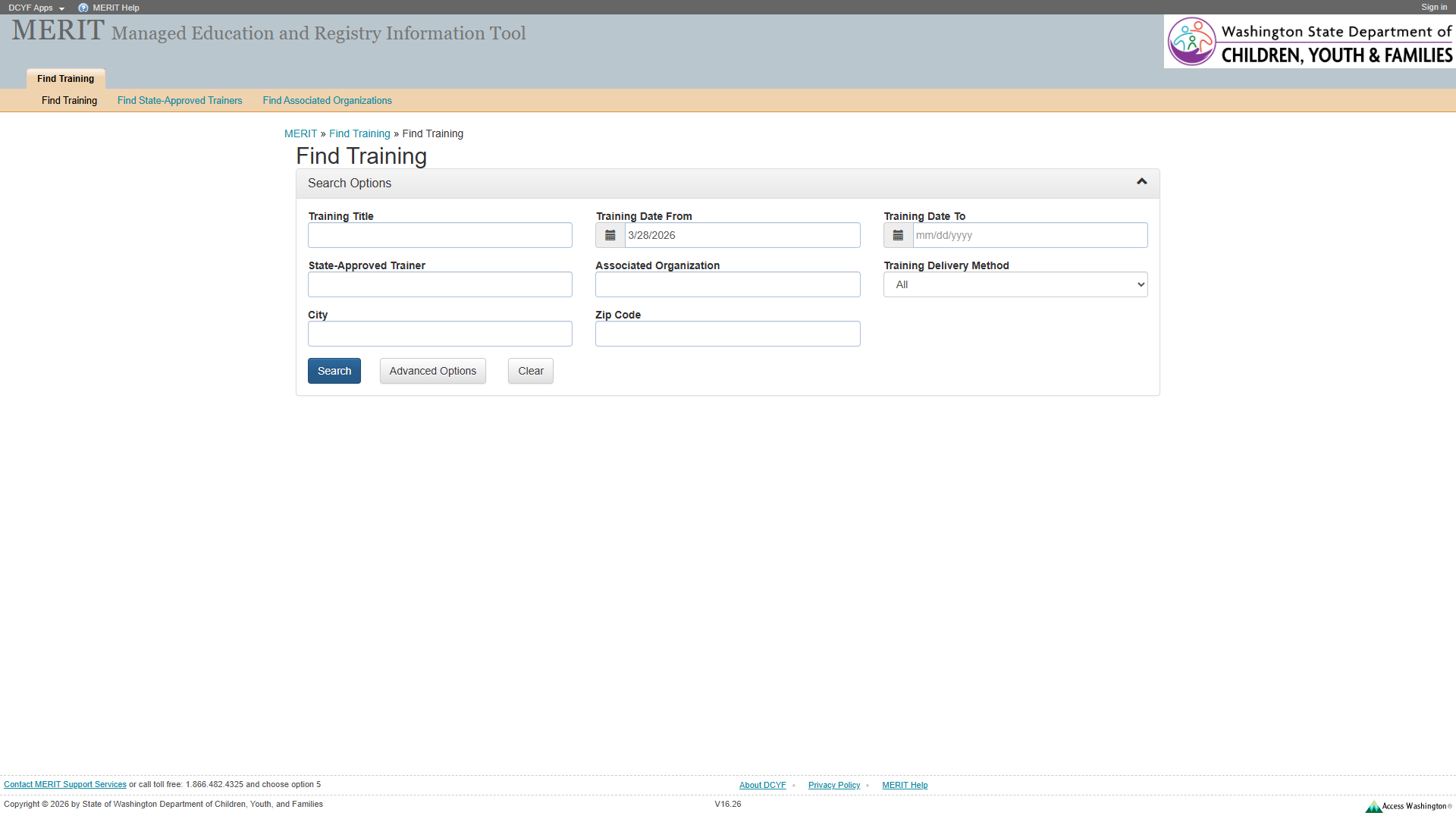
The search controls (text inputs, comboboxes, date fields, buttons) are not wrapped in a <form> element. Screen readers cannot identify the form boundary, and browser autofill and form-level keyboard submission may not work.
Wrap all search controls in <form role="search"> with appropriate action and method.
2
No Fieldset/Legend for Field Groups
Related form fields must be grouped with fieldset/legend
1.3.1
Required
Medium
Field groups, particularly the date range fields (Start Date / End Date), are not grouped in a <fieldset> with a <legend>. Users cannot perceive these fields as a related set.
Wrap the date range in <fieldset><legend>Date Range</legend>...</fieldset>. Consider grouping other logical sections similarly.
3
Breadcrumb Not Semantically Marked
Lists must be constructed with appropriate semantic markup
1.3.1
Required
Medium
The breadcrumb trail is a generic <div> with plain text and >> separators rather than a <nav aria-label="Breadcrumb"> containing an <ol> with <li> items. Screen readers cannot identify it as a breadcrumb trail.
Wrap in <nav aria-label="Breadcrumb"> containing an <ol> with <li> items. Add aria-current="page" to the current item.
4
Sub-Navigation Not in <nav>
Navigation lists should be designated with <nav> or role="navigation"
2.4.1
Best practice
Medium
The sub-navigation list containing “Find Training”, “Find State-Approved Trainers”, and “Find Associated Organizations” links is a bare <ul> with no <nav> wrapper.
Wrap in <nav aria-label="Search categories">.
5
“Search Options” Collapsible Heading
Collapsible content should use appropriate heading/disclosure pattern
–
Best practice
Low
The “Search Options” toggle that expands/collapses the search form panel does not follow the standard disclosure pattern with heading markup.
Use a <button> inside a heading element for the collapsible toggle, following the disclosure widget pattern.
Section 2: Links and Navigation
Standards reference: links-and-navigation.md
Evaluated
Pass
Fail
N/A
22
15
3
4
Findings
#
Topic
Requirement
WCAG
Level
Severity
Description
Proposed Fix
1
(Site-wide) No Skip Link
A “skip” link should be the first focusable element
2.4.1
Required
High
No skip link present. Keyboard users must tab through all header and navigation elements to reach the search form.
Add a visually-hidden, focus-visible skip link as the first focusable element targeting main content.
2
(Site-wide) “DCYF Apps” Dead Link
Links must have a valid destination
4.1.2
Required
Medium
“DCYF Apps” link has href="#", making it non-functional.
Replace href="#" with a valid URL or convert to <button>.
3
(Site-wide) “MERIT Help” Dead Link
Purpose of each link must be understandable
2.4.4
Required
Medium
“MERIT Help” link has href="#" and navigates nowhere.
Provide a valid URL to a help resource, or remove the link.
Section 3: Images and Visual Design
Standards reference: images-and-visual-design.md
Evaluated
Pass
Fail
N/A
15
11
2
2
Findings
#
Topic
Requirement
WCAG
Level
Severity
Description
Proposed Fix
1
(Site-wide) Access Washington Logo Alt Text
Image links should describe the destination
1.1.1
Required
Medium
Access Washington logo link uses alt text describing the image rather than the link destination.
Change alt to “Visit Access Washington” or add aria-label on the link.
2
(Site-wide) Small Footer Text
Fonts should be easily readable
–
Best practice
Low
Footer text at approximately 11px is very small for low-vision users.
Increase footer text to at least 14px using relative units.
Section 4: User Input, Forms, and Dynamic Content
Standards reference: user-input-forms.md
Evaluated
Pass
Fail
N/A
38
20
9
9
Findings
#
Topic
Requirement
WCAG
Level
Severity
Description
Proposed Fix
1
Form Labels Not Using <label> Elements
Labels must be programmatically associated with inputs
1.3.1
Required
Critical
Form labels are rendered as text nodes adjacent to inputs rather than <label> elements with for attributes. Screen readers announce inputs as unlabeled edit fields. This affects all search form fields.
Wrap each label in <label for="field-id"> or use aria-labelledby to create explicit associations for every input.
2
Combobox Accessible Name Mismatch
The accessible name should match or contain the visible label
2.5.3
Required
Critical
The “Training Delivery Method” combobox has an accessible name of “Training Delivery Method Training Topics” – concatenating two field labels. This mismatch means voice control users saying “Training Delivery Method” may not activate the correct control, and screen readers announce a confusing combined label.
Fix the accessible name to match the visible label “Training Delivery Method”. Ensure each combobox has its own distinct, accurate label.
3
No <form> Element
Form structure should use proper semantic markup
1.3.1
Required
High
Search controls are not in a <form> element. Assistive technologies cannot identify the form boundary. Users cannot submit the form via Enter key in a text field.
Wrap all search controls in a <form> element.
4
Date Format Instruction Only in Placeholder
Data input restrictions should be communicated in label or instructions
3.3.2
Required
High
Date fields (Start Date, End Date) display “mm/dd/yyyy” as placeholder text only. Placeholder disappears on input and is not reliably conveyed to screen readers. Users have no persistent indication of the required format.
Add format instruction as persistent visible text (e.g., “mm/dd/yyyy” as helper text) and associate via aria-describedby.
5
Collapsible “Search Options” Toggle Missing State
Toggle controls must communicate expanded/collapsed state
4.1.2
Required
Medium
The “Search Options” toggle that expands/collapses the search panel has no aria-expanded attribute and may not use a <button> role. Screen readers cannot convey whether the panel is open or closed.
Add role="button" (or use a <button> element) with aria-expanded="true/false" toggled by script. Add aria-controls referencing the panel id.
6
No role="search" Landmark
Search functionality should be in a search landmark
–
Best practice
Medium
The search form is not marked with role="search" or contained in a <search> element. Screen reader users cannot jump to it via landmark navigation.
Add role="search" to the <form> element or wrap in a <search> element.
7
No Required Field Indicators
Required fields should be designated programmatically and visually
3.3.2
Required
Medium
If any fields are required, there is no visual or programmatic indication. Users must submit and wait for errors to discover requirements.
Add required or aria-required="true" to required fields. Add visual indicators (asterisks with legend).
8
“Advanced Options” Button Lacks aria-expanded
Toggle controls must communicate expanded/collapsed state
4.1.2
Required
Low
The “Advanced Options” button that reveals additional search fields does not indicate its expanded/collapsed state to assistive technologies.
Add aria-expanded="true/false" to the button, toggled by script.
9
“Clear” Button Scope Unclear
Button purpose should be clear from its label
–
Best practice
Low
The “Clear” button does not indicate what it clears – the entire form, just the current section, or something else.
Rename to “Clear Search” or “Clear All Fields” for clarity.
Section 5: Multimedia, Animations, and Motion
Standards reference: multimedia-and-motion.md
Evaluated
Pass
Fail
N/A
5
0
0
5
No issues identified in this section.
No audio, video, multimedia, or animated content detected. No flashing content. No time-limited content visible.
Summary
Compliance Overview
Section
Evaluated
Pass
Fail
N/A
1. Structure & Semantics
27
18
5
4
2. Links & Navigation
22
15
3
4
3. Images & Visual Design
15
11
2
2
4. User Input, Forms & Dynamic Content
38
20
9
9
5. Multimedia, Animations & Motion
5
0
0
5
Total
107
64
19
24
Findings by Severity
Critical
Form labels are text nodes, not <label> elements – all inputs are unlabeled for assistive technology (S4 #1, WCAG 1.3.1)
Combobox accessible name “Training Delivery Method Training Topics” does not match visible label “Training Delivery Method” (S4 #2, WCAG 2.5.3)
High
No <form> element wrapping search controls (S1 #1, S4 #3, WCAG 1.3.1)
Date format instructions only in placeholder text (S4 #4, WCAG 3.3.2)
(Site-wide) No skip link (S2 #1, WCAG 2.4.1)
Medium
No fieldset/legend for date range field group (S1 #2, WCAG 1.3.1)
Breadcrumb not semantically marked (S1 #3, WCAG 1.3.1)
Sub-navigation not in <nav> (S1 #4, WCAG 2.4.1)
“Search Options” toggle missing aria-expanded and button role (S4 #5, WCAG 4.1.2)
No role="search" landmark (S4 #6)
No required field indicators (S4 #7, WCAG 3.3.2)
(Site-wide) “DCYF Apps” dead link (S2 #2, WCAG 4.1.2)
(Site-wide) “MERIT Help” dead link (S2 #3, WCAG 2.4.4)
(Site-wide) Access Washington logo alt text (S3 #1, WCAG 1.1.1)
This page has a <main> landmark, resolving the missing <main> issue found on the Welcome page.
The most impactful fix would be adding proper <label> elements to all form fields and fixing the combobox accessible name mismatch.
The search form is complex with multiple field types (text, combobox, date) and collapsible sections, making proper semantic markup especially important.
Focus indicators could not be visually confirmed from the automated screenshot; manual verification recommended.
Severity Definitions
Severity
Criteria
Critical
Required standard violated; completely blocks access for one or more disability groups (e.g., keyboard trap, no form labels, missing alt text on functional images)
High
Required standard violated; significant barrier that makes the feature very difficult to use (e.g., poor contrast on primary content, missing heading structure, focus indicator absent)
Medium
Required standard violated with moderate impact, OR Best practice violated with significant user impact (e.g., heading levels skipped, link purpose unclear from context, insufficient target size)
Low
Best practice not followed; minor impact on usability (e.g., title could be more concise, landmark count could be reduced, hover indicator could be enhanced)