Accessibility Audit: Find Training (Hub)
| Page URL | https://apps.dcyf.wa.gov/MERIT/Search |
| Page Name | Find Training (Hub) |
| Date | 2026-03-28 |
| Auditor | Claude Code (automated) |
| Standards Reference | docs/standards/ (WCAG 2.2 AA) |
Evidence
| Screenshot (1920x1080) | Screenshot (320px reflow) |
|---|---|
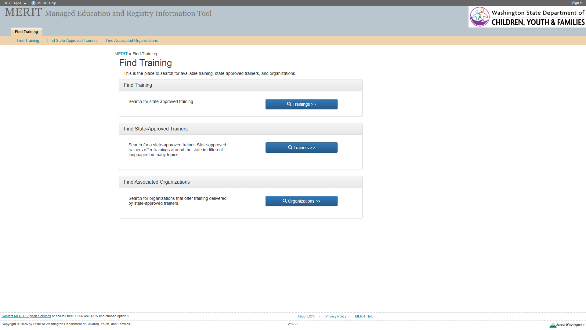 | 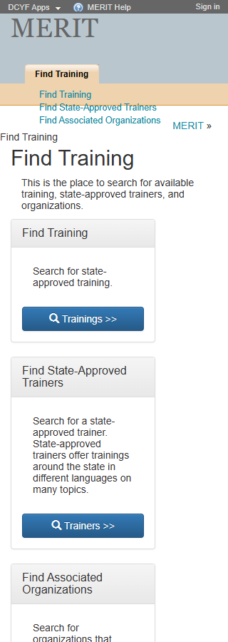 |
Site-Wide Issues (from Welcome page audit)
The following issues identified on the Welcome page remain present on this page. They are noted here but not re-evaluated in detail.
| Issue | Status |
|---|---|
| No skip link | Still present |
No <nav> element anywhere | Still present |
“MERIT Help” href="#" dead link in footer | Still present |
| Footer text at 11px | Still present |
| Access Washington logo link alt text describes image, not destination | Still present |
| H1 “MERIT” in banner, not main content | Still present |
Notable improvement: This page does have a <main> landmark (ref e32), resolving the missing <main> issue found on the Welcome page.
Section 1: Structure and Semantics
Standards reference: structure-and-semantics.md
| Evaluated | Pass | Fail | N/A |
|---|---|---|---|
| 33 | 22 | 3 | 8 |
Findings
| # | Topic | Requirement | WCAG | Level | Severity | Description | Proposed Fix |
|---|---|---|---|---|---|---|---|
| 1 | Breadcrumb Not Semantically Marked | Lists must be constructed with appropriate semantic markup | 1.3.1 | Required | Medium | The breadcrumb (“MERIT » Find Training”) at ref e33 is implemented as a generic <div> containing a link and plain text with a >> separator. It is not marked up as a list (<ol>) or given a <nav aria-label="Breadcrumb"> landmark. Screen readers cannot identify this as a navigational breadcrumb trail. | Wrap breadcrumb in <nav aria-label="Breadcrumb"> containing an <ol> with <li> items. Add aria-current="page" to the current page item. |
| 2 | Sub-Navigation List Not in <nav> | Navigation lists should be designated with <nav> or role="navigation" | 2.4.1 | Best practice | Medium | The sub-navigation list (ref e23) containing “Find Training”, “Find State-Approved Trainers”, and “Find Associated Organizations” links is a bare <ul> with no <nav> wrapper. Screen reader users cannot discover it via landmark navigation. | Wrap the sub-navigation in <nav aria-label="Search categories">. |
| 3 | “DCYF Apps” Dead Link in Header | Links must be semantically designated with a valid href | 4.1.2 | Required | Medium | “DCYF Apps” link (ref e8) has href="#", making it a non-functional link. This was not noted in the Welcome page audit as a separate finding; it may be new to authenticated/sub-pages or was present but missed. | Replace href="#" with a valid URL or convert to a <button> if it triggers scripted behavior. |
Site-wide: Missing skip link, H1 in banner – still present.
Section 2: Links and Navigation
Standards reference: links-and-navigation.md
| Evaluated | Pass | Fail | N/A |
|---|---|---|---|
| 35 | 21 | 5 | 9 |
Findings
| # | Topic | Requirement | WCAG | Level | Severity | Description | Proposed Fix |
|---|---|---|---|---|---|---|---|
| 1 | Buttons Used as Navigation Links | Links should navigate; buttons should not be used for navigation | — | Best practice | Medium | The three card buttons (“Trainings »”, “Trainers »”, “Organizations »”) at refs e46, e57, e68 are <button> elements that navigate to /MERIT/Search/Trainings, /MERIT/Search/Trainers, and /MERIT/Search/Organizations respectively. Navigation to a different URL should use <a> links, not <button>. Screen readers announce these as “button” rather than “link”, misrepresenting their function. | Replace <button> elements with <a href="/MERIT/Search/Trainings"> etc., styled as buttons. |
| 2 | Duplicate Link Text | Purpose of each link must be distinguishable | 2.4.4 | Required | Medium | The sub-navigation contains links labeled “Find Training”, “Find State-Approved Trainers”, “Find Associated Organizations” (refs e25-e29) that go to different URLs than the identically-labeled header tab links (refs e19, plus implicit items). Additionally, the main tab “Find Training” (ref e19) links to /MERIT/Search (this page), while the sub-nav “Find Training” (ref e25) links to /MERIT/Search/Trainings (a different page). Same text, different destinations. | Differentiate link text or provide context (e.g., sub-nav links could say “Search Trainings”, “Search Trainers”, “Search Organizations”). |
| 3 | Breadcrumb “MERIT” Link Not Descriptive | Purpose of each link must be understandable | 2.4.4 | Required | Low | Breadcrumb link “MERIT” (ref e34) navigates to /MERIT/ (the home page). While “MERIT” is the site name and context is somewhat clear, “MERIT Home” or a proper breadcrumb structure would be more explicit. | Use <nav aria-label="Breadcrumb"> with labeled list items; consider labeling as “MERIT Home”. |
| 4 | No Visible “You Are Here” Indicator for Sub-Nav | Navigation list should include visible current-page indicator | — | Best practice | Low | The header tab “Find Training” (ref e19) links to /MERIT/Search which is the current page, but there is no visible distinction (aria-current or styling) to indicate it is the active page. The sub-nav links (e25-e29) also have no current-page indicator. | Add aria-current="page" and distinct visual styling to the active nav item. |
| 5 | ”»” in Button Text May Confuse Screen Readers | Visual labels should match programmatic labels | 2.5.3 | Required | Low | Button text includes “»” characters (e.g., “Trainings »”). Screen readers may announce these as “greater-than greater-than” which is confusing. The leading space and empty <span> (refs e47, e58, e69) suggest an icon that is not conveyed semantically. | Use a visually-hidden icon (CSS or aria-hidden="true") for “»” and ensure button accessible name is just “Trainings”, “Trainers”, “Organizations” or similar. |
Site-wide: Skip link missing, “MERIT Help” dead link, no <nav> – still present.
Section 3: Images and Visual Design
Standards reference: images-and-visual-design.md
| Evaluated | Pass | Fail | N/A |
|---|---|---|---|
| 43 | 31 | 2 | 10 |
Findings
| # | Topic | Requirement | WCAG | Level | Severity | Description | Proposed Fix |
|---|---|---|---|---|---|---|---|
| 1 | Card Heading Contrast | Small text must have at least 4.5:1 contrast ratio | 1.4.3 | Required | Medium | The card section headings (“Find Training”, “Find State-Approved Trainers”, “Find Associated Organizations”) appear on a gray/tan card header background. From the screenshot, these appear to be dark text on a medium-gray background. If the contrast ratio falls below 4.5:1 for small text, this is a failure. Manual measurement recommended. | Verify contrast ratio of card heading text against card header background. Ensure at least 4.5:1 for text under 18pt, or 3:1 for large/bold text. |
| 2 | Button Icon Without Semantic Alternative | If an icon conveys information, alternative text must be provided | 1.1.1 | Required | Low | The search icon (magnifying glass) in each button (visible in screenshots as a glyph before “Trainings »”) is rendered via an empty <span> (refs e47, e58, e69) with no alt text or aria-label. The icon is likely decorative since the button text provides meaning, but the empty span should be explicitly marked decorative. | Add aria-hidden="true" to the icon spans to ensure they are ignored by assistive technologies. |
Site-wide: Footer text at 11px, Access Washington alt text – still present.
Section 4: User Input, Forms, and Dynamic Content
Standards reference: user-input-forms.md
| Evaluated | Pass | Fail | N/A |
|---|---|---|---|
| 117 | 14 | 1 | 102 |
Findings
| # | Topic | Requirement | WCAG | Level | Severity | Description | Proposed Fix |
|---|---|---|---|---|---|---|---|
| 1 | Buttons Navigate Instead of Performing Actions | Role must communicate semantic meaning; links vs. buttons | 4.1.2 | Required | Medium | The three card buttons (refs e46, e57, e68) are semantically <button> elements but function as navigation links. Their role (“button”) misrepresents their actual function (navigation). This confuses screen reader users who expect a button to perform an in-page action, not navigate to a new page. Voice control users saying “click Trainings link” would fail because there is no link with that name. | Change to <a> elements styled as buttons. This corrects both the role announcement and voice-activation expectations. |
No forms, custom widgets, dynamic content, or CAPTCHA are present on this page. The remaining 102 N/A items cover form inputs, labels, validation, timers, and CAPTCHA requirements that do not apply.
Section 5: Multimedia, Animations, and Motion
Standards reference: multimedia-and-motion.md
| Evaluated | Pass | Fail | N/A |
|---|---|---|---|
| 48 | 2 | 0 | 46 |
No issues identified in this section.
No audio, video, multimedia, or animated content detected. No flashing content (WCAG 2.3.1 pass). No time-limited content (WCAG 2.2.1 pass).
Summary
Compliance Overview
| Section | Evaluated | Pass | Fail | N/A |
|---|---|---|---|---|
| 1. Structure & Semantics | 33 | 22 | 3 | 8 |
| 2. Links & Navigation | 35 | 21 | 5 | 9 |
| 3. Images & Visual Design | 43 | 31 | 2 | 10 |
| 4. User Input, Forms & Dynamic Content | 117 | 14 | 1 | 102 |
| 5. Multimedia, Animations & Motion | 48 | 2 | 0 | 46 |
| Total | 276 | 90 | 11 | 175 |
Page-Specific Findings by Severity
High
- None unique to this page (site-wide issues like missing skip link and dead “MERIT Help” link remain the most impactful)
Medium
- Breadcrumb not semantically marked up as list or
<nav>landmark (WCAG 1.3.1) - Sub-navigation list not wrapped in
<nav>(WCAG 2.4.1) - “DCYF Apps” dead link with
href="#"(WCAG 4.1.2) - Three card buttons function as navigation links but use
<button>role (WCAG 4.1.2) - Duplicate link text between header tabs and sub-nav for “Find Training” pointing to different URLs (WCAG 2.4.4)
- Card heading contrast needs manual verification (WCAG 1.4.3)
Low
- Breadcrumb “MERIT” link could be more descriptive (WCAG 2.4.4)
- No visible “You Are Here” indicator on active nav items (Best practice)
- ”»” characters in button text may be read aloud as “greater-than” (WCAG 2.5.3)
- Empty icon spans in buttons should be marked
aria-hidden="true"(WCAG 1.1.1)
Improvement Over Welcome Page
This page includes a <main> landmark (ref e32), which was missing on the Welcome page. This is a notable improvement that provides screen reader users a way to navigate to the primary content area via landmark navigation.
Notes
- Page has
<main>landmark (ref e32) unlike the Welcome page – partially addresses bypass blocks requirement - The three navigation cards are a clean, simple pattern but would benefit from being
<a>links rather than<button>elements - Breadcrumb uses plain text “»” as separator rather than CSS or
aria-hiddenseparator - The sub-navigation (refs e23-e29) duplicates the card navigation below it, creating redundancy that could confuse screen reader users
- Header tab “Find Training” (ref e19) links to the current page (
/MERIT/Search) without any active/current indicator - Focus indicators could not be visually confirmed from the automated screenshot; manual verification recommended
- Contrast measurements for card headers require manual verification with a color contrast analyzer
Severity Definitions
| Severity | Criteria |
|---|---|
| Critical | Required standard violated; completely blocks access for one or more disability groups (e.g., keyboard trap, no form labels, missing alt text on functional images) |
| High | Required standard violated; significant barrier that makes the feature very difficult to use (e.g., poor contrast on primary content, missing heading structure, focus indicator absent) |
| Medium | Required standard violated with moderate impact, OR Best practice violated with significant user impact (e.g., heading levels skipped, link purpose unclear from context, insufficient target size) |
| Low | Best practice not followed; minor impact on usability (e.g., title could be more concise, landmark count could be reduced, hover indicator could be enhanced) |